Microsoft internal request system · Project lead · 2026
Case Study · Microsoft CE&S BI
Microsoft internal request system.
How Microsoft employees file and track requests, redesigned for desktop, mobile, and an agent in Teams. I led the project.
Overview
Microsoft’s Customer Experience & Success BI team maintains the data platform and analytics tools behind reporting for 20,000+ client accounts. Employees file two kinds of requests with it: bug fixes, and PBIs (Product Backlog Items) for new reports and enhancements. It received 52,000 work items between July 2025 and February 2026.
Tools
- Figma
- Fluent 2
- Microsoft Teams
- Role
- Project lead
- Client
- Microsoft CE&S BI
- Timeline
- Jan–May 2026
- Scope
- DesktopMobileAgentic
- Live inside Microsoft, on the CE&S BI portal
- 40% less time to fill in a request, overall
- 4 down to 2 ways in: four product paths became bug or PBI
- 3 jobs in one place: submit, track, edit
Problem
Requesters had to contact the support team just to get a request through.
Problem 01: Redundant paths
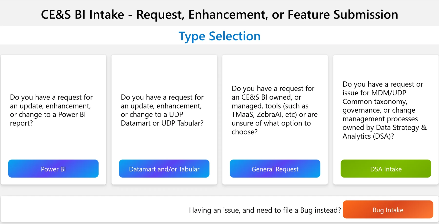
Four product paths for PBIs, and Bug Intake repeated the same steps again.
Problem 02: Too much decoding
Acronyms and dense groups slowed infrequent requesters.
Problem 03: No closure
After submit, tracking and edits felt like a different system.
My role
Project leadership
- Led the weekly sponsor reviews on field rules, routing and Adaptive Card scope.
- Led both rounds of usability testing, and presented the work to the CE&S BI team.
Product strategy
- Distilled the research into three requirements: request tracking, feedback after submit, and a simpler form.
- Kept one request model across desktop, mobile and Teams.
Design
- Owned the request model: entry, details, confirm, track, edit, the same on every surface.
- Fluent-grounded components, grid and guidelines, handed to CE&S BI engineering.
AI prototyping
- Ran the AI-assisted prototyping in Figma Make that the first test round used.
- Built the Adaptive Cards from JSON with the two teammates who code.
Process
- 01 · Literature reviewFive rules for a good form.
The reading gave us five rules for a good form.
We read up on form design, decision-making and cognitive load, and sorted it on an affinity board. Five principles came out: plain wording, a logical order with clear sections, feedback, helpful error messages, and the right input for each field. We judged the old form by them.
- 02 · Heuristic evaluationWhere the old form broke them.
The old bug form broke our own five rules.
We walked through filing a bug on the old form and marked where it broke those principles. Three problems: acronyms like LOB, MBR and QBR; related fields, like the reproduction and error details, kept apart; and a crowded two-column layout. So: grouped sections, in one column.
- 03 · Competitive analysisStatus you can read at a glance.
Good tracking tools make status readable at a glance.
From screenshots, we compared ticketing tools (Salesforce, Jira, Zendesk, Freshdesk), dashboards (Trello, ClickUp, Smartsheet), BrightWork 365, which Microsoft uses internally, and bug report templates. Three patterns carried over: color-coded status chips, clearly categorized fields, and long forms split into groups.
- 04 · User interviewsFields that didn’t say what they wanted.
The fields didn’t say what they wanted.
We interviewed one Microsoft employee and two students acting as requesters.
Input field confusion
The Microsoft employee explained the issue in the open Description box and ignored the other formatted fields.
So we kept the open Description field and moved the rest into grouped sections.
Field ambiguity
“Business Target Date” and “Expected Completion Date” weren’t clearly different.
Redundant guidance
Placeholders repeated the field label instead of giving an example.
Round 1 found the same gap at the title field (Validation, in 04).
Findings
Three requirements: request tracking, feedback after submit, and a simpler form.
Language & fields
Internal names helped the fixers route work. Requesters spent their time decoding labels, acronyms and field groups before they could submit.
Structure & timing
The fields sponsors needed were never the problem. The order, the grouping, and what happened after submit were.
Status & closure
Receipt, progress, and edit access were part of the job, not a follow-up email days later.
Surface density
Desktop could carry tables and filters; mobile needed card density; Teams needed the lightest Adaptive Card touch.
How might we
How might we improve request intake so requesters can submit easily across Web, Mobile, and Adaptive Cards?
Solution
Four paths became two entry points.
One request model on three surfaces. Each fix answers a problem from 01.
Answers problem 01: Four paths in
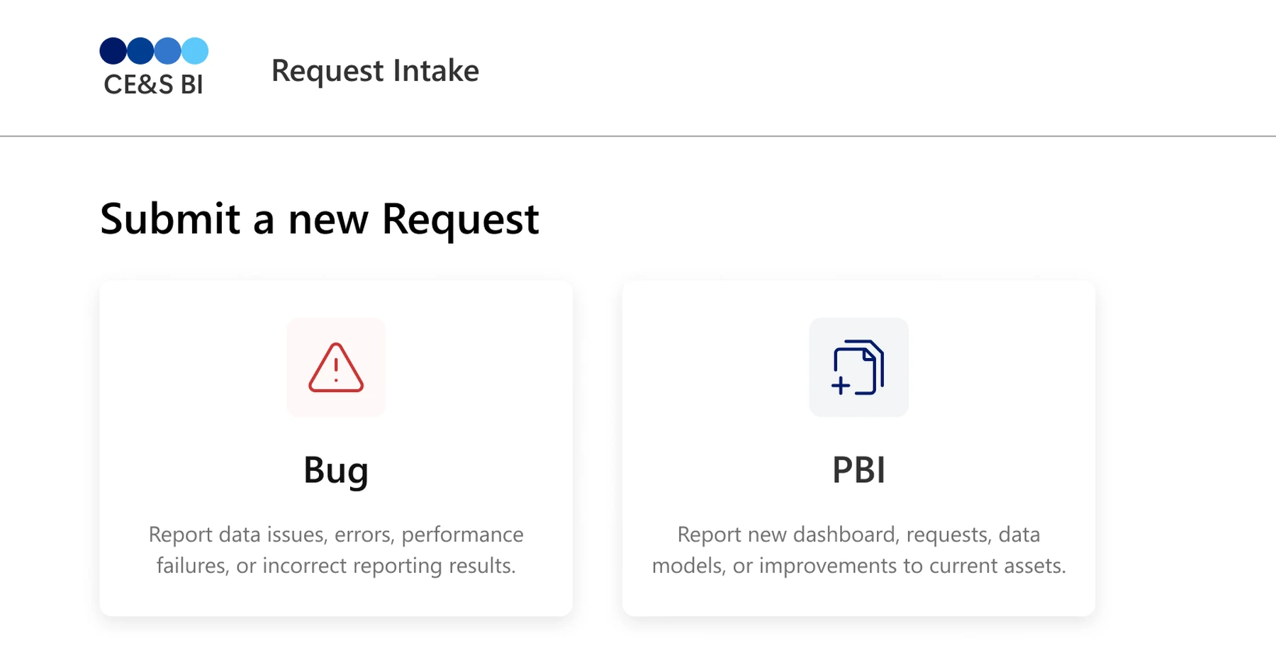
Two entry points: bug or PBI.
The hub opens with two clear actions, then platform and details.
Answers problem 02: Too much decoding
The dense form became guided one-column steps.
Detail appears only when it’s needed, and acronyms are spelled out on first use.
Answers problem 03: Stopped at submit
Submit stopped being a dead end.
Status chips, updates and editing keep every request visible until it’s resolved.
WebDesktop hub
Start, filter, track, and reopen requests in one place.
MobileMobile manager
Cards, pinned actions, and tabbed detail for field use.
AgenticTeams
The agent pre-fills the request in Teams. You submit it.
Microsoft is bringing Adaptive Cards to its agentic workflows: cards that pre-fill a request for you, in Teams, in Outlook, and beyond. We built ours in Teams. I co-designed the flows, and the cards are built from Adaptive Card JSON.
Three steps, all in the chat.
- YouMessage the agent in Teams.
- AgentAsks for what’s missing, then pre-fills the card.
- YouReview the card, submit it, and track it.
How the agent behaves
- It asks only for what it can’t tellBug or PBI, which platform, and which report. To track a request, which request.
- It fills the card for youA pre-populated form card arrives in the chat, and you add the details it couldn’t know.
- You submit, not the agentOnce every required field is filled, you review the entries and submit. A confirmation follows, with a card to view the request.
- It knows when to stopIf it still can’t tell after a few tries, it stops asking and sends you to the web app.
Three cards: Form, every field a new request needs, in a clear order; View request, the status at a glance, the details one step away; Edit, pre-filled, with the longer fields folded.
Built on the Microsoft Teams UI Kit and reviewed with our sponsors. Usability testing of the agent is the recommended next step.
You message the agent, it asks for what’s missing, and it returns a pre-filled card to review, submit and track, without leaving the chat.
The takeaway
Start a request on the web, on your phone or in Teams, and track it from any of them.
A multi-platform system: start a request on the web, on your phone, or in the Teams chat you are already in, and track it anywhere. Whichever channel people are in, the request reaches them.
- Web
- Mobile
- Teams
A request started on desktop can be tracked in Teams and edited on mobile without learning anything new.
Impact
Built, handed over, and deployed inside Microsoft.
- 40% less time to fill in a request, overall
- 113 down to 60 words to read before choosing the right request
- 12 down to 7 fields on the busiest screen, now in one column
- 0 up to 5 lines of help on screen, where it sat behind (i) icons
Words, fields and help counted on the team’s own screens, before and after.
“Both applications were officially launched. This is a significant milestone, and your contributions played an important role in making it happen.”
“Very impressive how you guys were able to ship out three different designs for desktop, mobile, and then adaptive cards.”
“Providing this creates us the ability to standardize across multiple projects. We actually are using UI principles across other projects that are unrelated to this one.”
Reflection
What leading this project taught me.
Meet users where they are
Iteration and AI prototyping are fast now. Listening is still the step that matters. In enterprise UX that means learning exactly what people are used to, and redesigning around it, not around best practices that don’t fit them.
Own the product
This was an internal Microsoft tool. Before recommending anything, I learned it inside out, and that is what let me be bold with people who had used it for years.
Collaborate, and ask
We were a seven-person team, so we started by recognizing each person’s core skills and worked together around them. Then we asked our stakeholders for what we lacked: developers, walkthroughs, users to test with. That took steady communication with the platform owners and our sponsor.
Establish context
Making it easy for the requester started with context: for the team, for the sponsors, and in every screen we shipped.
Go deeper
The process, for anyone who wants it.
Want more? Each of these opens in place.
ValidationThe journey held. The wording didn’t.
Entry, details, confirm, track, and edit held across both rounds. We changed legibility, field guidance and confirmation, never the shape of the journey.
Round 1 · AI-assisted prototype
Testers · Round 1 · Our notes Nearly all participants did not notice the required title format until after they received an error.
In the session notes, one tester wished the title had no set format, or a clearer one.
So we changed
The expected format now sits in the field as an example, before anyone types.
See the form ↑Student tester · Round 1 · Our notes Stopped at “Revenue” and “Business Impact,” and asked for acronyms like PBI and DSA to be spelled out. The Microsoft employees understood them.
So we changed
We kept the labels the BI team relies on, made both fields dropdowns with set ranges, and spelled acronyms out on first use.
See the form ↑Testers · Round 1 · Our notes Everyone found Edit Request quickly. Several said the confirmation after saving was minimal or unclear.
So we changed
Every save now shows a confirmation and lands as a new entry in the activity feed. In round 2, edits went through without confusion.
See tracking ↑Tester · Round 1 · Our notes The priority slider was finicky; radio buttons with descriptions would be clearer.
Round 2 · High fidelity, desktop and mobile
Tester · Round 2 · Desktop “Doesn’t look like a button.”
On the Bug and PBI entry tiles. Her one change: make them “more obvious or look more like a button.”
So we changed
The entry cards got refined icons and a clearer treatment, so they read as buttons at a glance.
See the hub ↑Testers · Round 2 · Desktop · Our notes One tester liked the progress bar; another said seeing her progress at the top was helpful.
So we changed
It gained a hover and a filled state, so you can see which step you’re on and how far along you are.
See the form ↑Testers · Round 2 · Mobile · Our notes The floating + did the same job as the Bug and PBI buttons already at the top, and added clutter.
In the session notes, one tester called it repetitive; another found the buttons on the page easier to use.
So we changed
The + went. Bug and PBI stay pinned at the top while Recent Requests scrolls under them.
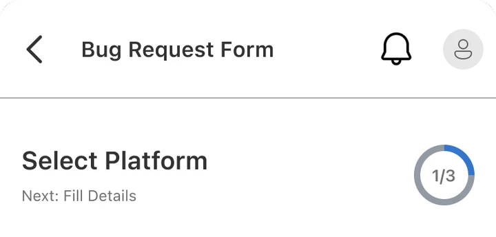
See it in 03 ↑Testers · Round 2 · Mobile · Our notes The step timeline took up valuable vertical space; several testers had to scroll past it before they could start the form.
So we changed
A compact progress circle replaced it. Students also flagged the missing priority chips, so the desktop chips came to mobile.
See before and after ↓
Microsoft employees · Round 2 · Our notes
What happens if a user selects the wrong request? Does the system reassign it to a different person?
The same session also asked whether a new activity-feed message sends an email, and whether several requests can be submitted at once.
Still open
It went on the agenda for the sponsor meeting of 17 April. No answer is recorded.
Round 2 on mobile, before and after
Two rounds of usability testing, 10 Microsoft requesters in each, after early rounds with students standing in for them.
Considered, and droppedA floating + for new requests.
Mobile testing showed it did the same job as the Bug and PBI buttons already at the top of the dashboard. So the button went, and those two were pinned there.
Design processStructure first, Microsoft’s design language last.
From paper to a Fluent-grounded system, in that order.
Sketches & ideation
Entry, steps, and tracking, mapped on paper first.
We started on paper, mapping Bug vs PBI entry, a stepped form and status tracking, before Figma Make or any Fluent polish.
AI-assisted prototyping
Mid-fidelity: iterate, prototype, validate.
We fed our whiteboard outlines to Figma Make and had a clickable flow the same week. It was deliberately bare, so testing judged the structure and the grouping rather than the styling. Running variants side by side let us compare fixes as fast as the feedback came in.
Segoe UI · San Francisco Pro Display
Typography
From the Fluent 2 type ramps: 17 desktop styles in Segoe UI, 12 mobile styles in SF Pro, one scale across surfaces.
Primary · Secondary · Windows UI · Neutrals
Color as roles, not swatches
CE&S BI brand ramps tinted 50 to 900 for accessible pairings, with text and accent duties from the Windows UI kit.
Vertical grid · 12 column · 1440px
Grid system
A 12-column structure on a 4-point rhythm, so components, headers and body text line up the same way on every screen.
Desktop · Mobile
Component library
Fluent patterns used as they were wherever they fit. The intake-specific pieces, entry cards, status chips and progress steppers, were built to Fluent’s spec.
The request modelOne model, cross-platform.
Each one shows as much as its screen can hold, and no more.
Each cell is the real screen for that stage. Press one to see it whole.
Swipe for Confirm, Track and Edit.

Want the 20-minute walkthrough of the Figma file? Email me.